
05 Jul Esri Thailand Case Study: “ArcGIS” contributes to data reporting in Kingkaew factory explosion
One firefighter was killed and scores of others injured in a recent explosion at a factory producing plastic foam and plastic pellets in the Kingkaew area, Bang Phli District, Samut Prakan. The resulting blaze caused widespread damage to houses and buildings in the vicinity. Concerns of further explosions, caused by the storage of some 50 tonnes of chemicals at the factory, prompted authorities to order the urgent evacuation of thousands of residents within a five-kilometer radius. The situation was brought under control three days later.
Solution
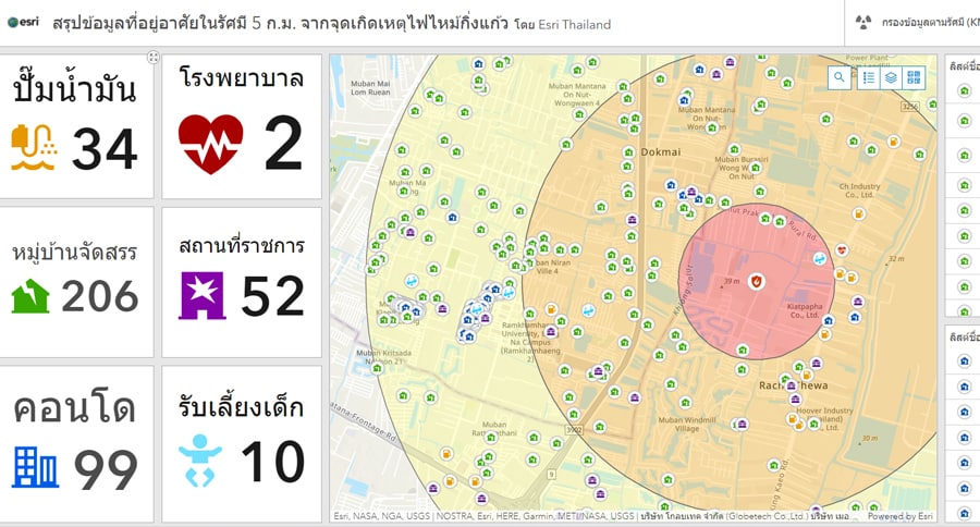
Within two hours of this emergency and in response to it, Esri Thailand set up a dashboard to display various locations within a five-kilometer radius of the blast site, including housing estates, condominiums, hospitals, government offices, gas stations and nurseries. The dashboard – which is interactive – also showed concentration levels of styrene monomer within the one-kilometer, three-kilometer and five-kilometer radius as well as wind direction, to evaluate the direction of toxic smoke, allowing people to check which areas were affected or at risk, assess the situation and make a decision to evacuate. All this information was easily accessible via website, accommodating both desktop and mobile users.
The mapping and analytics tools used by the Esri team for emergency response include:
• ArcGIS Pro: This tool was used to perform an analysis and summarize data, e.g., spatial analysis, to determine risk areas within the one-kilometer, three-kilometer and five-kilometer radius. It was also used to identify the number of sites from NOSTRA Landmarks data layers in the risk areas within the one-kilometer, three-kilometer and five-kilometer radius. Additionally, this tool helped in calculating the number of sites based on category (namely housing estates, condominiums, etc.) by means of spatial autocorrelation analysis.
• ArcGIS Web AppBuilder: to apply the analysis model of the spread of styrene monomer to the blast site on the map, as this tool contains information related to hazardous chemicals, e.g., the spread of toxic fumes through the air, in order for authorities or first responders to plan preventive measures or emergency evacuations.
• ArcGIS Online: for data hosting and web app on Esri’s cloud (SaaS) which can be used promptly without any installation needed and can accommodate a high amount of traffic without a need for tuning or server monitoring based on traffic volume.
• ArcGIS Dashboards: Data obtained from the analysis was displayed in an interactive dashboard. The general public could look up various sites with ease and select a filter to see only information within a desired radius or according to a certain wind direction. With no coding required, ArcGis Dashboards can provide real-time data promptly in an emergency situation. They also accommodate two views for computer or notebook screens and a responsive web on smartphones or tablets, which can be used anywhere and anytime.
In addition, a key element in the analysis was data of sites from across the country provided by NOSTRA, operated by GlobeTech Co., Ltd., a digital map solutions provider. Data of key sites such as housing estates, condominiums, hospitals, government offices, gas stations, nurseries and evacuation centers were organized to form essential information, including concentration levels of styrene monomer from the Pollution Control Department. The public was then alerted to the levels of pollution within the one-kilometer, three-kilometer and five-kilometer radius from the blast site. Moreover, real-time wind direction provided by www.windy.com was shown so that people could track the direction of the smoke or the toxic fumes.
Result
ArcGIS Dashboards, developed from the above-mentioned powerful tools, are able to obtain and present data in an event of emergency or disaster that requires a quick response, so that the general public or relevant agencies are able to plan or act accordingly. They can also help authorities to have a comprehensive view of the situation and make forecasts.
• The number of sites, including housing estates, condominiums, hospitals, government offices and nurseries within a five-kilometer radius from the blast site, was calculated. Areas surrounding the blast site were divided into five zones: within one, three, five, seven and ten kilometers. Each were coded in different colors, from dark red (highest risk) to light yellow (monitoring), in descending order.
• Population in the areas near the blast site, by sex and age, presented in an infographic.
• Real-time wind direction map, with information on concentration levels of styrene monomer, so the public could check which areas were affected based on wind direction.
• Data visualization, designed as a responsive web page, was easily accessible anywhere and anytime.
ArcGIS Dashboards, which present data in such a way that it is easily understood and come with the ready-to-use tools with no coding required, have been used in several emergency situations that require prompt response. Examples include counts of COVID-19 cases worldwide (John Hopkins University), monitoring of Air Quality Index (AQI) and PM 2.5 and other disasters including wildfires, floods, tsunamis, earthquakes and tropical storms.